Color Schemes That Leave a Lasting Impression on Hotel Guests
Color has the power to evoke emotions and shape perceptions, making it a crucial element in the hospitality industry. When guests step into a hotel, the colors they encounter can influence their overall impression and satisfaction. From bold, vibrant palettes that energize to soothing earth tones that promote relaxation, selecting the right color scheme can significantly enhance a guest’s experience. This post will guide you through popular color schemes that not only reflect your brand identity but also leave a lasting impression. Whether you’re working with hotel painting contractors or considering a DIY approach, we’ll explore how thoughtful color choices can transform your property into a welcoming haven for travelers.## Color Schemes That Impress
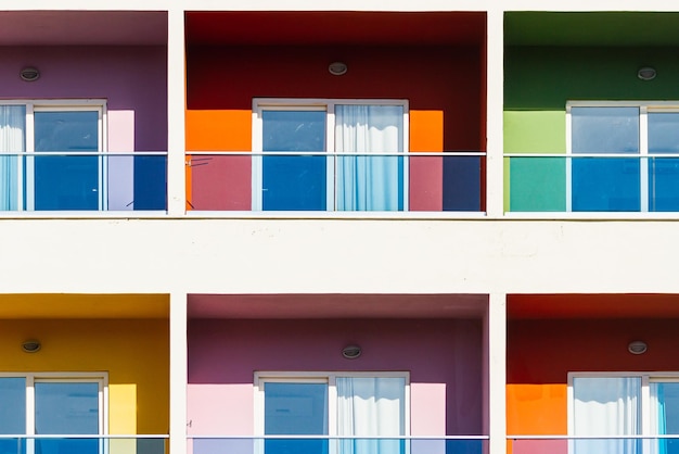
The right color scheme can transform a hotel from ordinary to extraordinary. This section explores how carefully chosen palettes can create lasting impressions and enhance the overall guest experience.
Impact on Guest Experience
Color plays a crucial role in shaping guest perceptions and emotions during their stay. The right combination of hues can create a welcoming atmosphere, influence mood, and even affect decision-making processes.
Studies have shown that certain colors can evoke specific feelings. For example, blue tones often promote calmness and relaxation, making them ideal for bedrooms and spa areas. In contrast, warm colors like reds and oranges can stimulate appetite, making them suitable for dining spaces.
The impact of color extends beyond emotional responses. It can also affect guests’ perception of space, temperature, and time. Light colors can make rooms appear larger and more airy, while darker shades can create a cozy, intimate ambiance.
Consider the following color associations when planning your hotel’s palette:
-
Blue: Tranquility, trust, professionalism
-
Green: Nature, freshness, growth
-
Yellow: Optimism, energy, warmth
-
Red: Excitement, passion, urgency
-
Purple: Luxury, creativity, mystery
Choosing the Right Palette
Selecting the perfect color scheme for your hotel requires careful consideration of various factors. It’s not just about personal preferences; it’s about creating a cohesive and appealing environment that aligns with your brand identity and target audience.
Start by defining your hotel’s personality and the emotions you want to evoke in your guests. Are you aiming for a serene retreat or a vibrant urban hotspot? This will guide your initial color choices.
Next, consider your location and surroundings. A beachside resort might benefit from a palette inspired by sand, sea, and sky, while a city hotel could draw inspiration from the urban landscape.
Don’t forget to factor in practical considerations. Light colors are easier to maintain and can make spaces appear larger, while darker hues may require more frequent touch-ups but can create a sense of luxury and intimacy.
Lastly, test your chosen palette in different lighting conditions. Colors can appear dramatically different under natural daylight versus artificial lighting, so it’s crucial to ensure your scheme works well in all scenarios.

